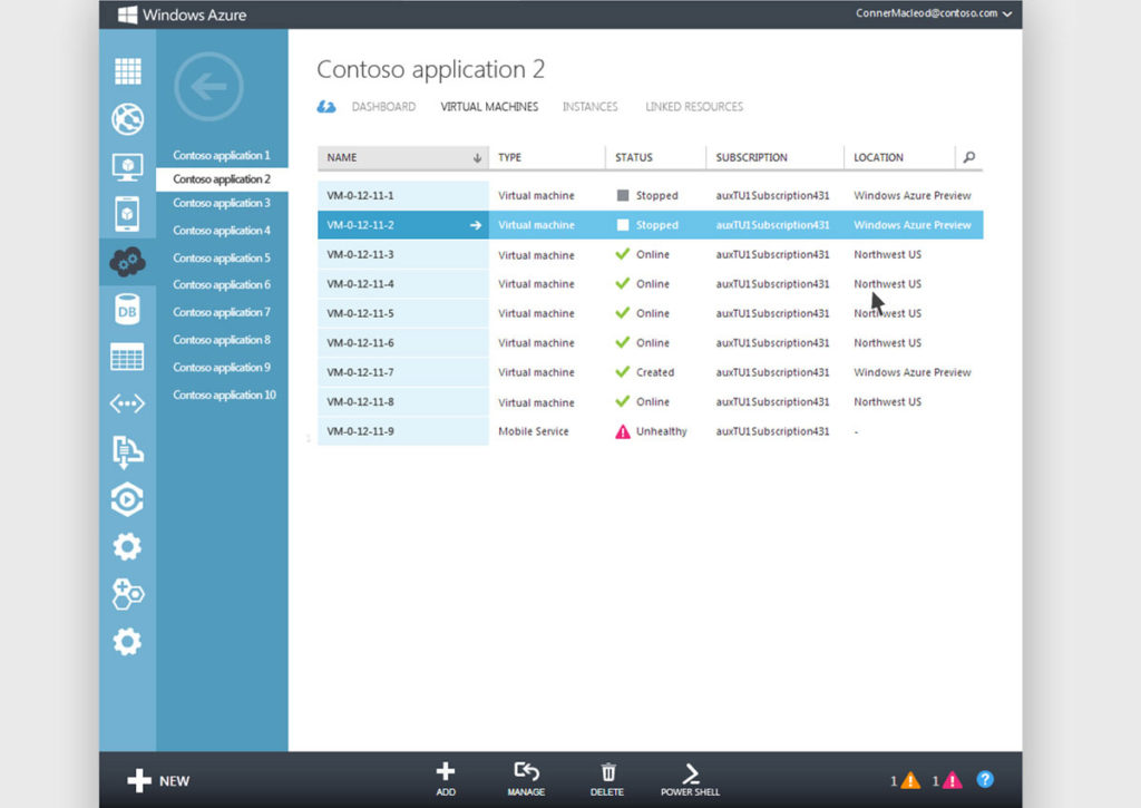
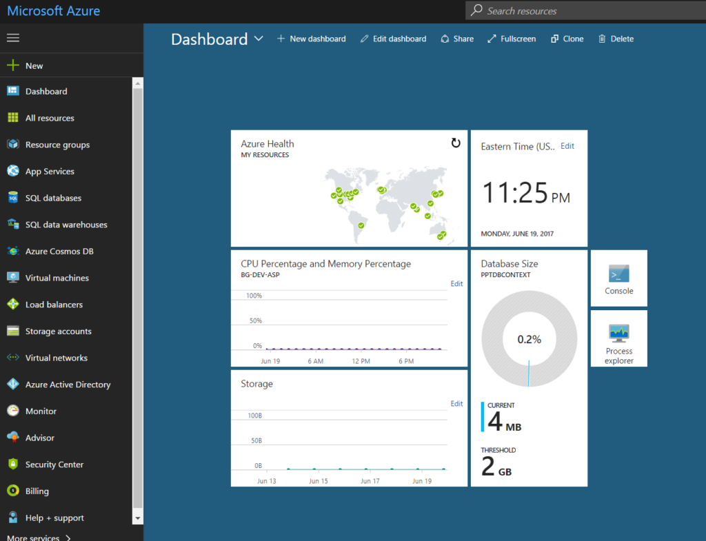
This was especially a problem last year as Microsoft was transitioning from the “classic” portal to a new “preview” portal.
Back then, all of the Azure services were on the classic portal, however, Microsoft was launching a brand-new “preview” portal, which was re-imagined from scratch, and it promised to be more modern and slick than its predecessor.
The problem was that a lot of the documentation and online videos were based on the classic portal, and a lot of the services were yet to make their way through to the new “preview” portal.
These days, however, this is not much of a problem.
The classic Azure portal can still be accessed here: http://manage.windowsazure.com

I, and most of the developers I know, do majority of our Azure administration using the new “preview” portal, which is in general availability since December 2015, and is simply referred to as the “Azure portal”, or the “new Azure portal” if you’re trying to be really specific.
The new Azure portal can be accessed here: http://portal.azure.com

It’s important to note that the difference between these two portals is not simply just about the look-and-feel, but also about the underlying deployment model: ASM (Azure Service Management) vs. ARM (Azure Resource Manager).
Microsoft recommends that all new resources be deployed using the ARM deployment model, and that is the underlying model of the new portal.
Sure, there are some services that still haven’t been migrated over to the new model, but this is increasingly rare, and for all intents and purposes you should adopt ARM fully!
The good news is that the new ARM deployment model and the new portal work quite well together, and they appear to be the way going forward. So, investing time in learning both will prove to be quite invaluable in the long term.
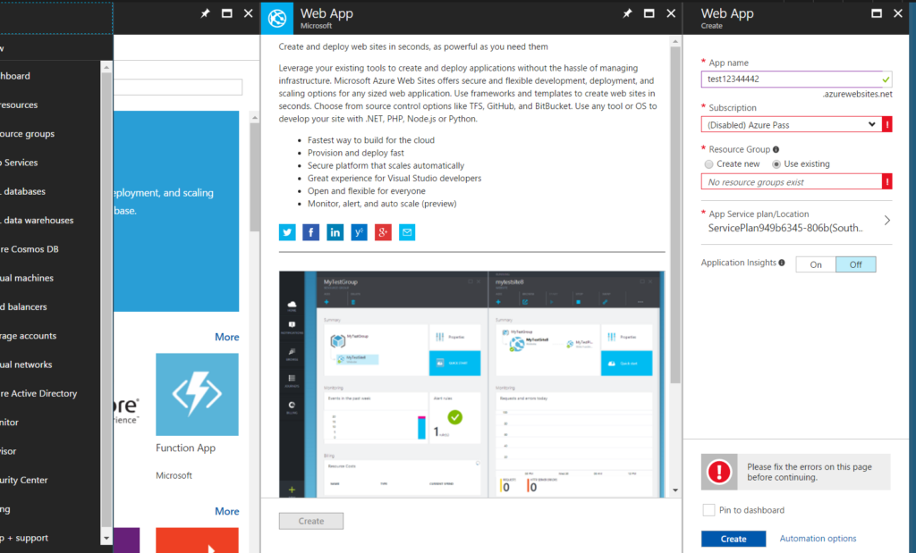
Visually, the new portal is a bit of a departure from what you’re normally used to from a website in that it disallows right-clicks and seems to want to keep you in a single-tab.
Individual panes (or blades, as they are called), are opened to the right of each other, creating a horizontal scroll instead of a typical vertical scroll.
At first, this takes some getting used to, but I actually prefer it now.
Long gone are the days of tab hell where the tab headers are so small that you can’t even tell which tab is which. Instead, everything is housed within a single tab like an operating system or a remote desktop session that lives inside your browser. Also, if you have a touch screen, or have a track pad on your laptop, then scrolling horizontally is just as convenient as scrolling vertically (hello to all my friends and colleagues who *love* their Macs).

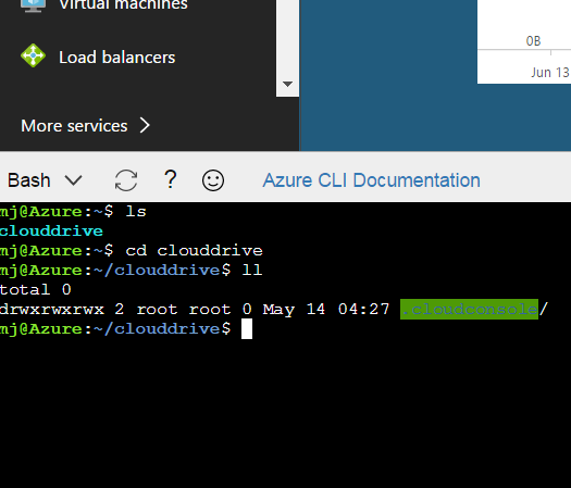
Oh, and did I mention that you could also spin up a terminal at any point in time in the portal itself, and start using your mad Azure CLI 2.0 skillz (soon PowerShell too) to navigate and administer your resources. This is a recent addition to the portal, and makes it quite easy to flip between a GUI and a terminal, no matter what computer (or phone!) you’re on.

Finally, I should mention that now that the “new portal” is simply “the portal“, Microsoft has created a way for us to sample upcoming improvements and features ahead of time by using what it’s calling the “preview portal“. This is a bit of an overloaded term at this point, I know, but I guess if you’re always charging forward, then the “preview” to “current” cycle is bound to be short.
You can access this preview portal here: http://preview.portal.azure.com
Mostly, it looks just like the “new” portal, but whenever there are enhancements to the portal (UI or performance or otherwise), then they are made available in this preview portal first. So be sure to check it once in a while, especially if you hear of any new portal enhancements coming down the line.
I hope this clarifies some of the portal confusion you might have, and here’s to a fruitful time learning and using the latest and greatest all these resources have to offer!
Stay curious,
MJ